


Managing Images on Substack
(alternatives to AI)

I posted an earlier version on Notes after chatting with Pamela Leavey and reading Debbie Ridpath Ohi’s caution against using AI images. I cleaned it up and added a few more links. Happy imaging.
I don’t know anything about growing a newsletter, but I’ve been blogging for fifteen years so I know the personal satisfaction of doing something over a long period of time.
This is primarily a written medium, but we can create a visual identity using images and post thumbnails. Except for the few folks who are exploring the world of artificial intelligence, I hope you will avoid AI as a shortcut for creating a cohesive environment for your newsletter.
When you utilize the images that are produced by artists, a subtle humanity shines through your Substack page — even if the visuals are a curated collection of images by other artists. It might be a little work, but once you get used to this extra step, I promise it’s fun to to meander through the visual record!
Plus avoiding AI images signals a respect for the visual arts. Would you want a painter chopping your essays with ChatGPT to write their newsletters?
Public Domain. My OPM Letters use Black and White photos, often found via Flickr (searched under “No known copyright restrictions”). Public Domain images are usually either 95+ years old or photos published by government agencies. Since these images are included within the newsletter itself, I credit the artist in the caption.
Substack Thumbnails. I use Flickr for photos and Rawpixel for illustrations. In both cases I still skew old (before 1980 with photos and public domain for illustrations). I like the vibe and it also minimizes the risk of accidentally using AI images. If someone is using AI to make 1970’s street photos or 1890’s pen and ink illustrations, they’ve got one heck of a niche and I’ll live with being tricked.
I’ve never used Unsplash myself, but I just heard a cool tip for using their images — find an image that doesn’t have too many views (five digits or less).
Since it’s only a thumbnail, I don’t go out of my way to credit the artist since the image is not in the post itself.
Editing. I modify public domain images in Pixlr E. I went through the steep digital image editing learning curve in grad school, so I don’t know if the program is easy to learn, but if you are somewhat familiar with image editing tools, this is a great online program that does everything I want out of Adobe Photoshop.
Reviews. If I’m commenting on a book or movie, I just grab a cover off the internet for the thumbnail. I’m not a lawyer but it feels like fair use and makes it easy to see in the archives.
Do it yourself! Unfortunately I’m not a cartoonist — yet! So I’m eagerly following Mick J Scott’s new series to help folks draw for toffee (part 1 and part 2). While you’re at it, join Debbie and pull out a mirror and make faces.
I love the bold powerful (and deceptively simple) drawings by d.w. at One Could Argue. Meaghan McIsaac’s Authorstrator and Paula Borchardt’s Visual Story Teller newsletters also both have strong hands.
Don’t forget writers who are also great photographers, like Charlene Storey’s Haver & Sparrow, Chapin’s A Sourdough Story, and Pamela Leavy’s Words and Pictures.
Consistent graphic features also create coherence, like the polaroid frames on luscious photos at Ten Thousand Journeys by Priya Iyer, or the simple consistent brush text on image at Taegan MacLean’s One Word, and the cup and brushes in Debbie Ridpath Ohi’s Picture Book 101 series.
If you want a jumpstart on branding yourself, check out the Sunstack Soiree. I’m a bit too cranky an architect to follow someone else’s template, but the results I’ve seen are great!
Hire a Pro! If you can invest some money in your publication, illustrators like
have offered their services. wrote a great piece about her illustration process for CAFE ANNE.
As for my motley collection of Substack thumbnails, I think I’ve done a decent job (though it’s currently heavy on my alphabet-hand drawings since I haven’t been writing many essays). Within my Substack, I’m proud of the visual coherence of my Penny Delights section and OPM Letters. And while not as consistent, I feel that the Microessays section looks decent for minimal effort.
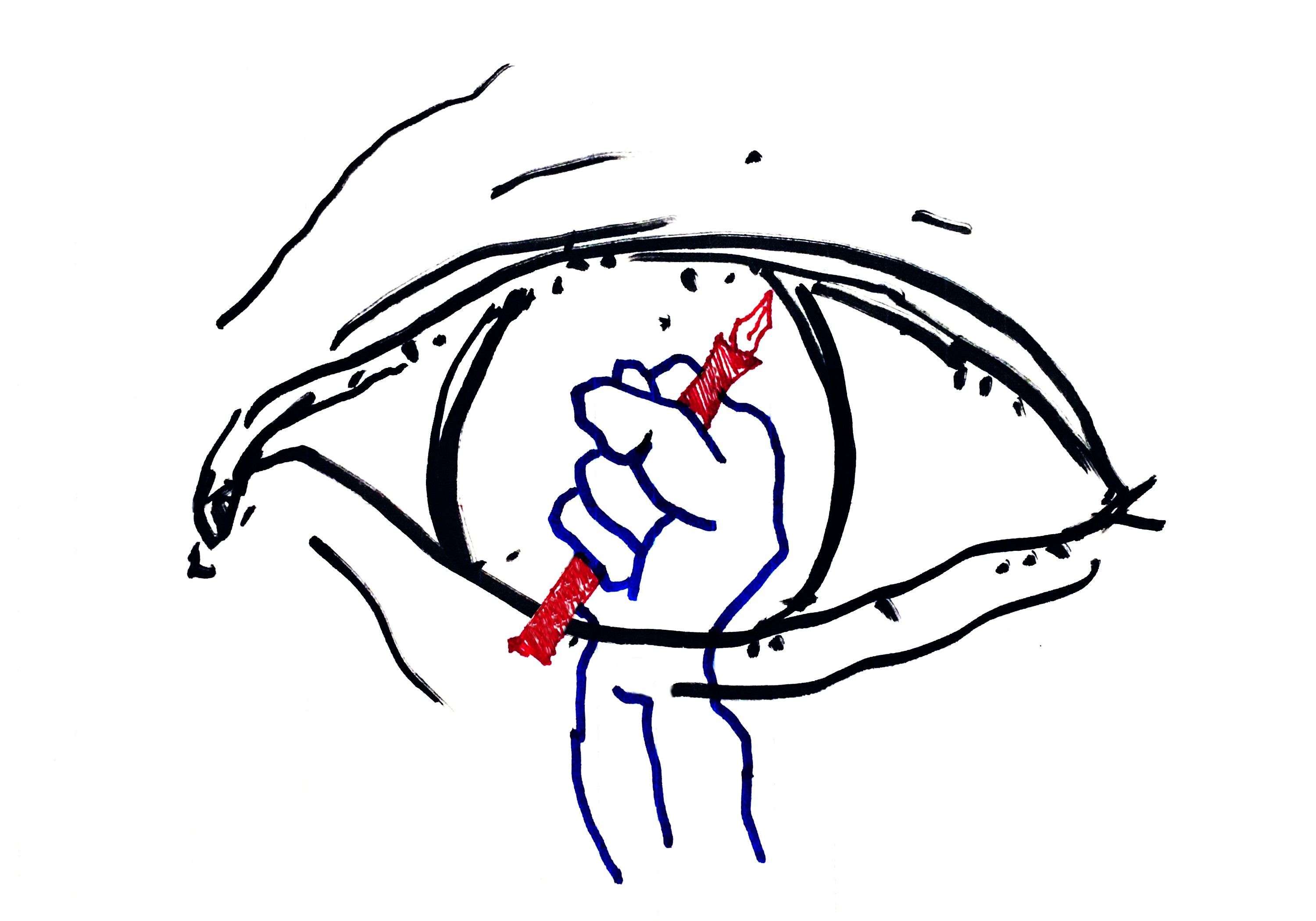
Have fun! Trust your hand and don’t outsource your eye to the machine!
Good tips! I thought I was gonna have to lean on AI for making my album covers this year, but photos plus pixlr was way more fun and yielded better results, especially when getting help from my wife. I think AI images can look pretty obvious and similar, but they can also help provide something particular if you are going for it. Though, now editing software (of all types) seems to be getting "AI" heavy. I do like it better as a tool than as "the creator".
Thank you for adding me to this fantastic community. I’m familiar with some of the writers you mention here, but I’m off to check out the new-to-me work. Happy holidays, and have a fantastic 2024!