I was indecisive with several of these.
<Insert insincere self-deprecating apology for uploading too many versions>
,
symmetry
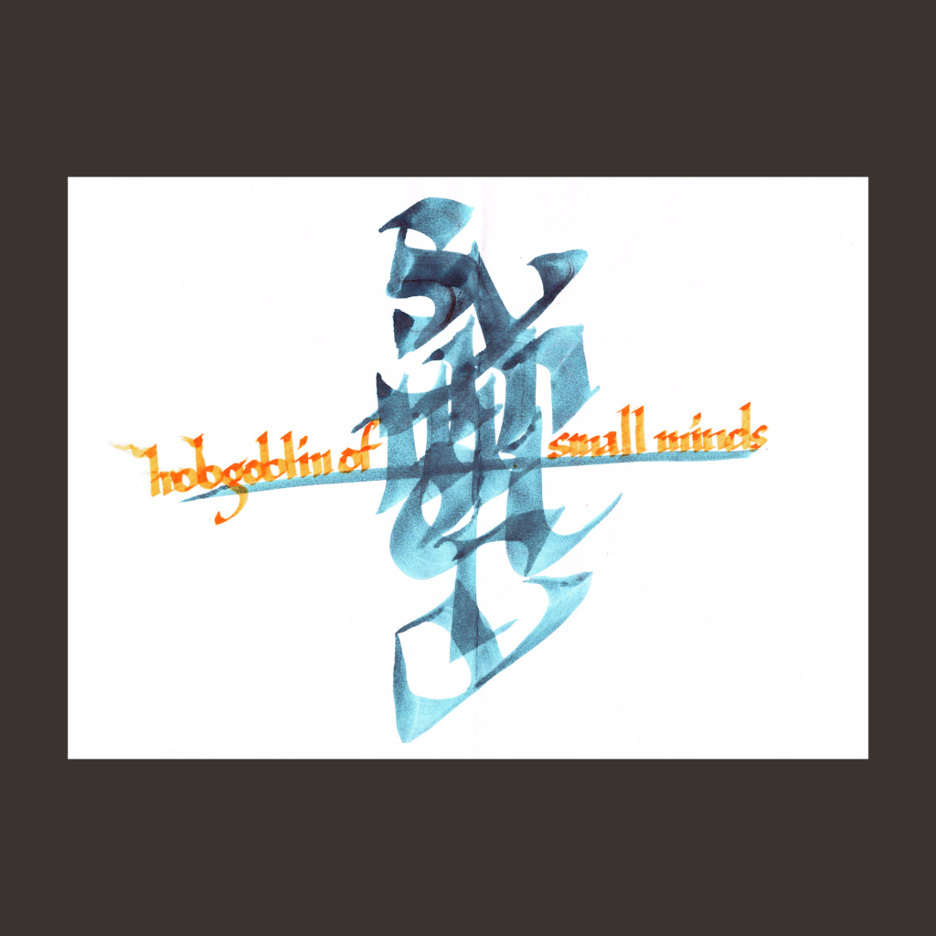
hobgoblin of small minds
I first heard the Emerson quote "consistency is the hobgoblin of small minds" at Rogers+Labarthe Architects. We were hung up on the lighting layout in a hallway (a trickier task than it might seem). One of them whipped out this line to keep things moving.
The top image is more or less how it looks on the page (after darkening the orange). The lower image uses the same ink, but with the contrast pushed hard. This blue is from a wash bottle where I salvage cool colored ink from pens and brushes before rinsing the tools.
,
wild style
takes
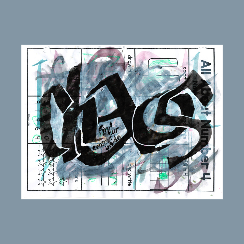
boring
practice
I used a grey-ink wash bottle for the liquid to activate the watercolors on the top image. I need to explore this further, but the dirty colors were not the right fit for this word. I should have pushed the saturation harder on the lower image, but I already went heavy on the digital pushing on "symmetry" and "glow up" (last week), so I let it be.
,
find your center inside
chaos
Super-graphics are tough because they have to be both expressive and "right". I often use old sheets for test runs. With chaos, it was natural to appropriate such backgrounds for finished pieces. Normally, the background noise makes the smaller words unreadable, but this prompt frees you splash heavy with the opaque ink.
,
synchronicity
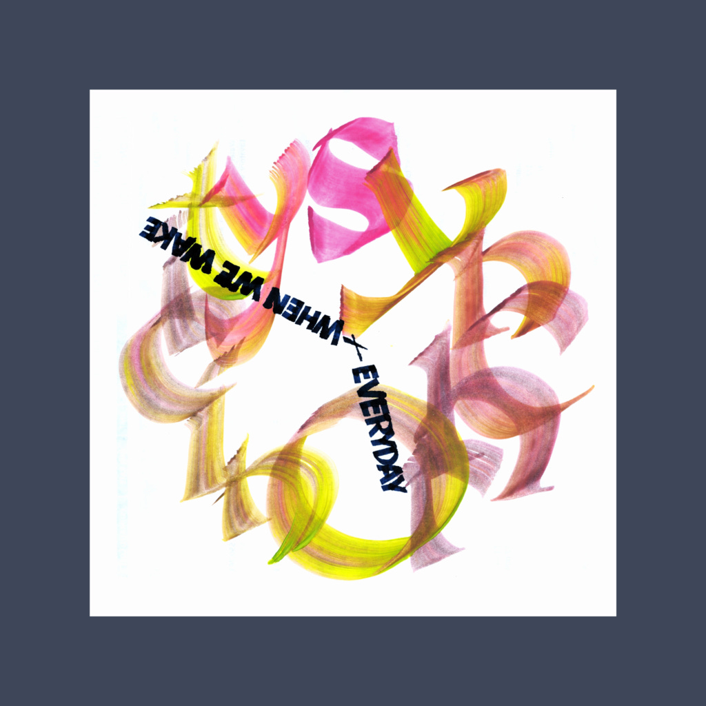
everyday
when we wake
I miscounted the letters when I decided upon with the clock-face concept. Didn't realize there were thirteen letters until my second try! Oh well, a compound word is a bit of a cheat too.
,
culture
swings
via
any
tongue
After taking fifteen shots, you'd think I know how to spell tongue, but I just mistyped it a second ago. This poem was inspired by the prompt "култура", but I wasn't about to learn Bulgarian.
When studying flourishes, I realized that there is quite an art to it. Since I had no idea what I was doing, I went overboard. As a beginner, it wasn't going to look good, so going heavy at least made it appear possibly intentional. (I posted the middle version for Instagram—Goldilocks would be proud).
,
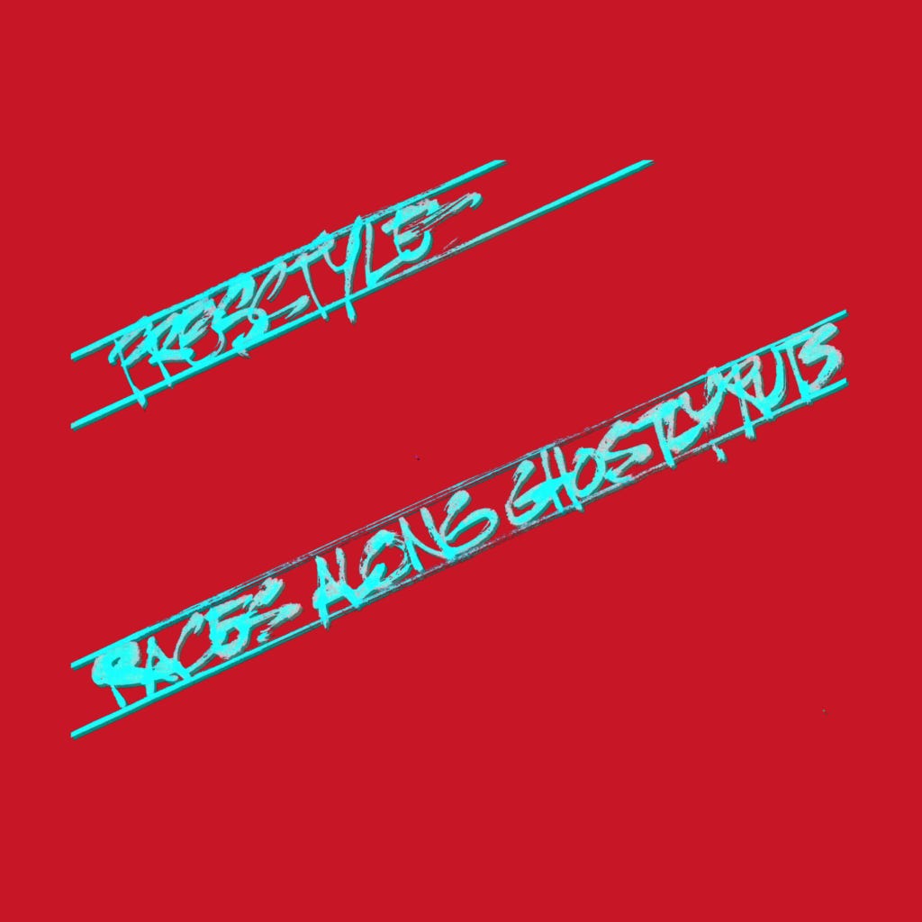
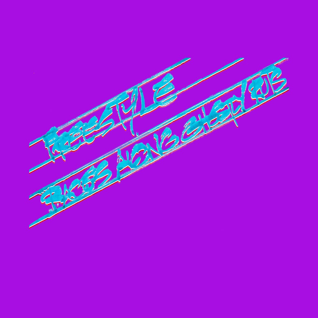
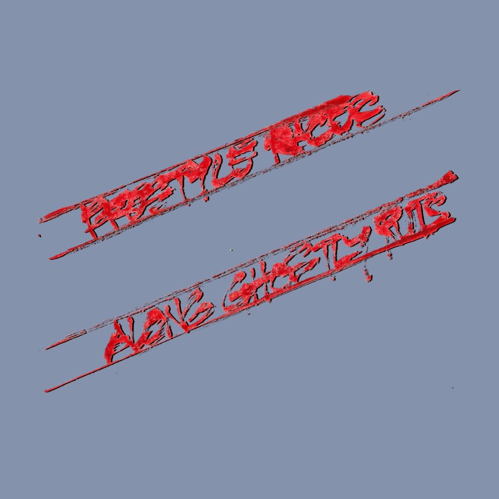
freestyle races
along ghostly ruts
I could not envision a good composition, so I finally settled the concept of tire tread marks. That didn't look good on the paper, but it had promise, and the computer came through. It took time, but this was the fun type of digital manipulation.
,
One Saturday, I went on a streak of truthy remarks on design.
The hard part of being a professional is knowing when to trust your personal tendencies and knowing when to do exactly the opposite. Actually, the hardest part is just doing the damn work.
I'm not a great design architect. But I have become more fluid at switching gears when I slam into a wall. Sometimes you need to brute force a problem, but it's usually more efficient to step laterally and approach the question from a different angle with a fresh technique.
The creative life is a cycle of expansion and refinement.
I was given this nugget in grad school before embarking upon on my master's thesis. There is a tendency to stay in high level to avoid tackling the project. Maybe this applies with my continued emphasis on pushing out new 5WP's instead of focusing on specific skills.
When picking between two good versions to publish, bias towards the one that you fear the audience will dislike. (You could say "challenge the audience"…but that’s not properly scary sounding for such a moment).
I'm a huge fan of default biases, "rules of thumb". For this, I'm worried about the subtle effect of algorithmic Instagram metrics in shaping my instincts. So whenever what image to post, it's best go against such subconscious Meta-training (unlike these newsletters, I only post one image per prompt on IG).
Congrats on the new job! If you think it’s time to change, you were way overdue!
Fear prudently keeps us from making rash changes, but don't waste your career staying comfortably miserable.
Selling writing courses on Substack is that "selling pickaxes to gold miners" phenomena....miners who love to stare at their navels and talk about it endlessly.
Including me, right now!
Cya next week!
,
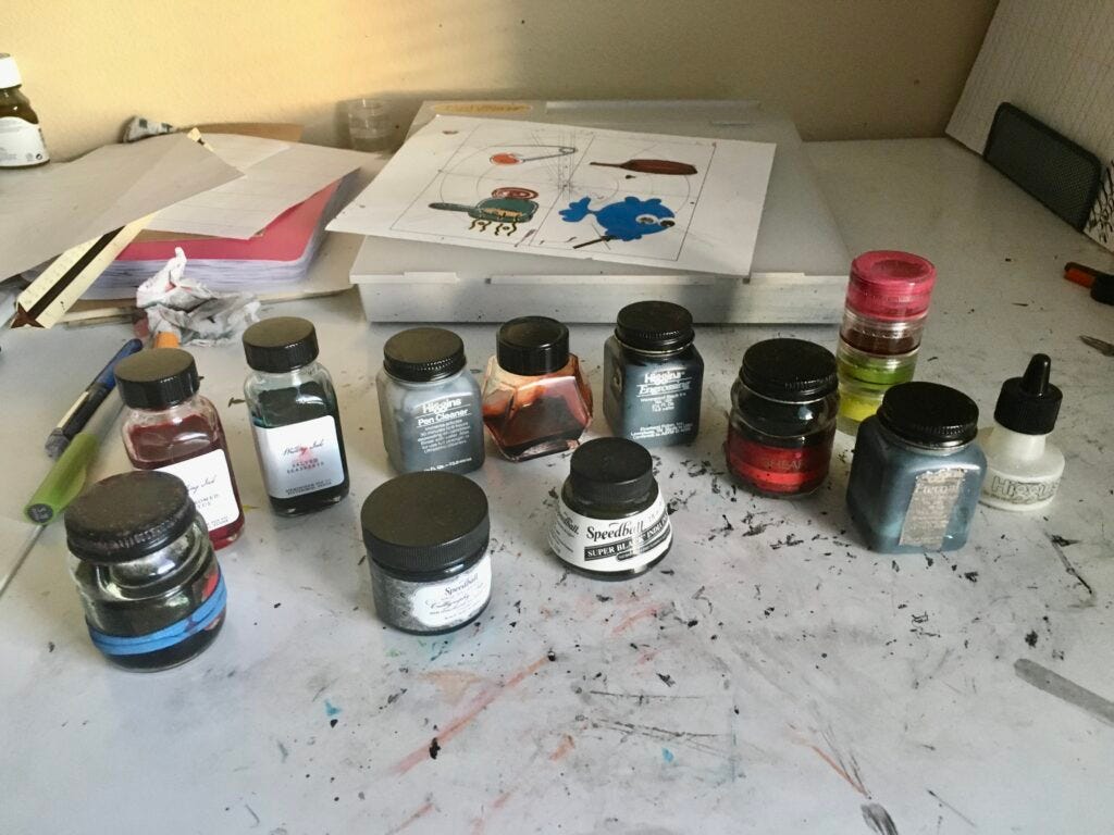
PS—After mentioning my old ink bottles for pre-rinsing tools, here is a photo of the bottles that stay on my work desk (most of my proper ink bottles are stored elsewhere)
Doing a cycle starting from the front left:
Sheaffer Sepia Ink (with the blue rubber bands). Purchased before college, I use it for trial compositions. The ink is light enough that the paper can be reused for future tests and as a brown, I'm not worried about the ink color getting contaminated. But unlike my wash bottles, this handles as real fountain pen ink.
Speedball Calligraphy. This was a recent purchase to feel how a new bottle of india ink is supposed to act.
Speedball Super Black India Ink. A late college purchase, the ink had gummed up after decades of non-use, Happily, it was revived with a little water.
Shaffer Red Ink bottle (the original red was finished last year). I use this bottle to wash off tools that used warm colored ink.
Higgins Bottle (with the masking tape). I use this bottle to wash off tools that used cool colored ink.
Higgins White. Bought during college, I'm finally using it. I suspect that white gouache would be more opaque, but gonna use this up first.
Stacking containers of various ink and gouache mixes. It was a cheap purchase from Walmart, but surprisingly airtight. These little mixes haven't dried out in the past few weeks!
Higgins Engrossing Ink. This bottle was totally gummed up, but revived decently. Not as nice as my old bottle of Speedball India Ink, so I'm using this up first.
Birmingham Magma. I bought big bottle of this awesome ink. Took a little of for an empty Parker bottle.
Higgins Pen Cleaner. I had been using this for Noodler's Lexington Grey, but now it's a fresh a pen wash for black ink, so that I can let the other two colored washes bottles stay more brighter with their inks.
Birmingham Salted Sea Breeze.
Birmingham Blossomed Lotus. It's always nice to have a light blue and a pink on hand. Plus these two are a little too tall to fit the art box that contain the rest of my my inks.
Honorary non-ink mention. The sheet on the light table has a circle on one side and rectangular template on the other side. I have used it for about a quarter of Callivember.
,
PPS—My Substack buddy
just had a new bunny move into their home. He composes real poems with nice calligraphy. Cheers!Moki
harbinger
of home
destruction
.











Love seeing all the iterations and how you keep pushing each piece, Justus. The quote about choosing something to challenge your audience gets me thinking...It's almost anti-branding. I like that.
HA! Good for Moki! We named our bunny, Midnight, the Biker Bunny from Hell. The cats were scared to death of him.
I do like that last adage about selling writing courses on Substack. I had a writer buddy who kept taking classes in writing. I told her to stop wasting time doing that and JUST WRITE SOMETHING. She finally wrote a novel, but kept revising and rewriting and futzing around with it. I don't know if she ever advanced to sending it off to agents/publishers.