I kept pushing the graphics this week, to the point of dropping letters and even a word. I enjoy the visual puns, but this pace is not sustainable. Then again, we're two-thirds through, so maybe I'll just rest in November.
,
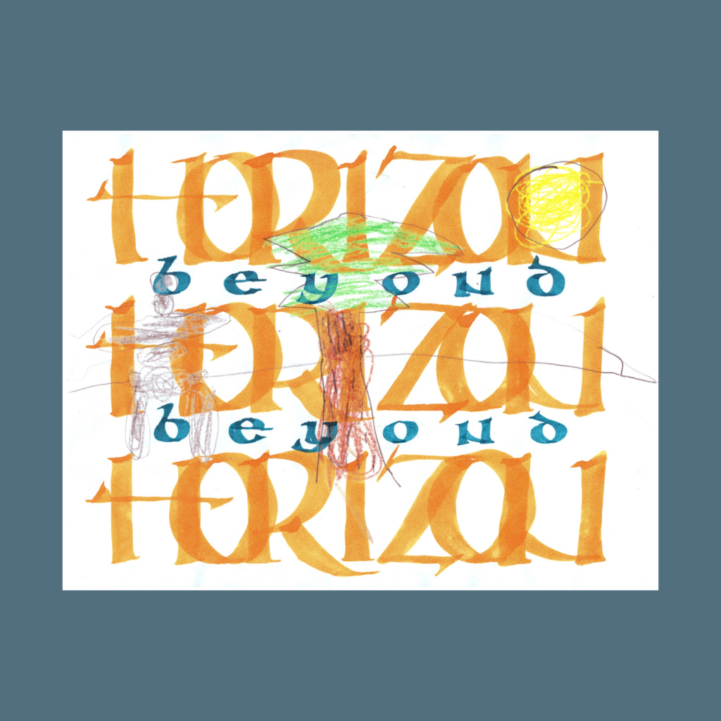
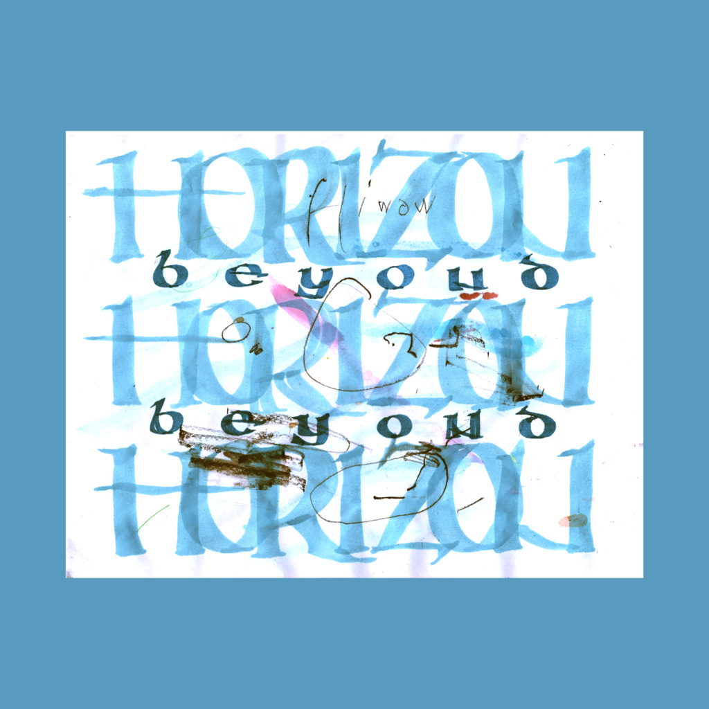
horizon
beyond
horizon
beyond
horizon
This was a frustrating composition. None of the various schemes felt right. I eventually settled on this because I ran out of time.
After posting this composition, I read Alan Furber's short book Layout and Design for Calligraphers. It's absolute gold. It energized the practice for the rest of this week. Total recommend, especially since it's cheap on the used market.
,
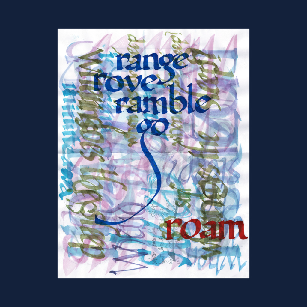
range
rove
ramble
go
roam
I thought the Furber book would lead me to simpler compositions to execute, which was an accurate prediction for two days.
,
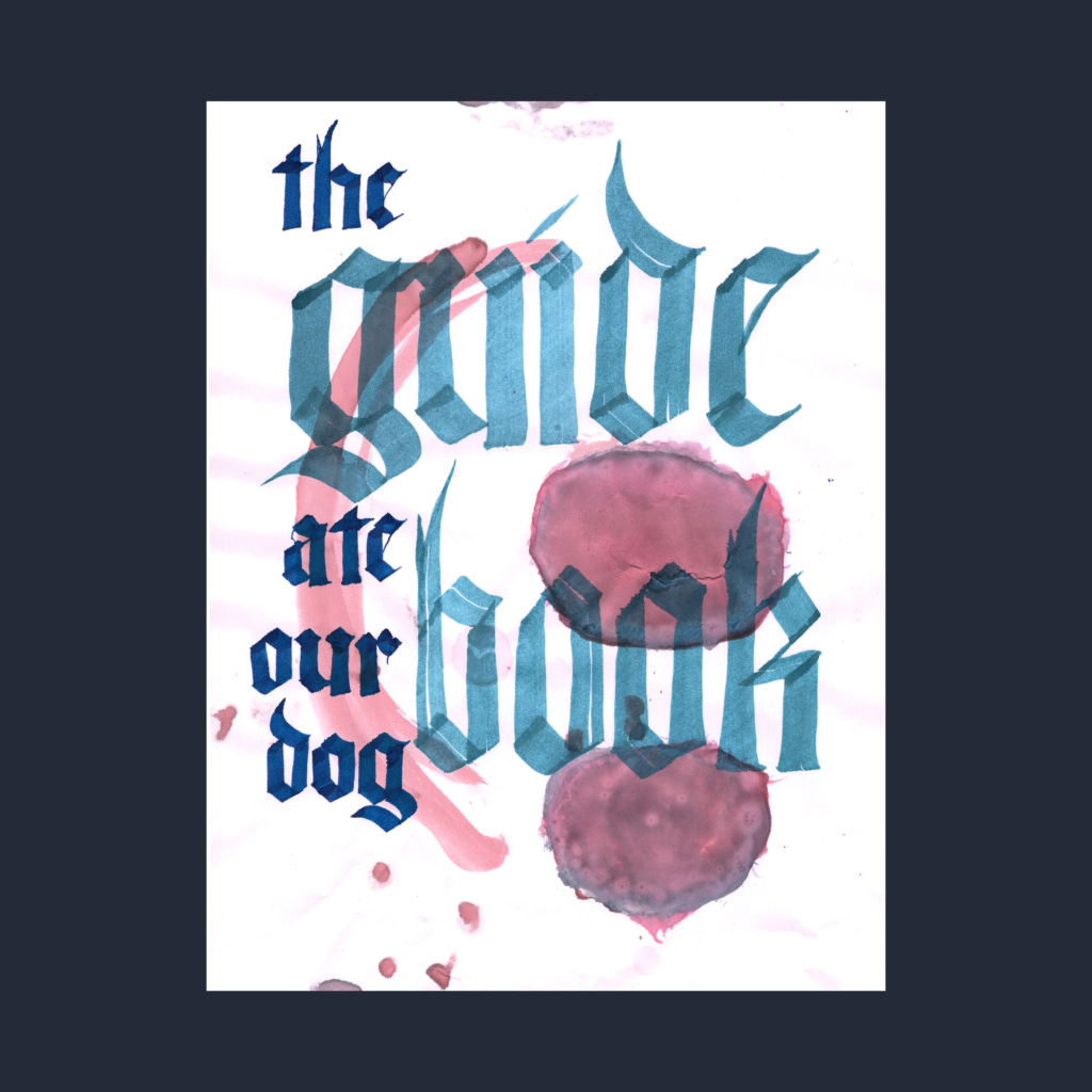
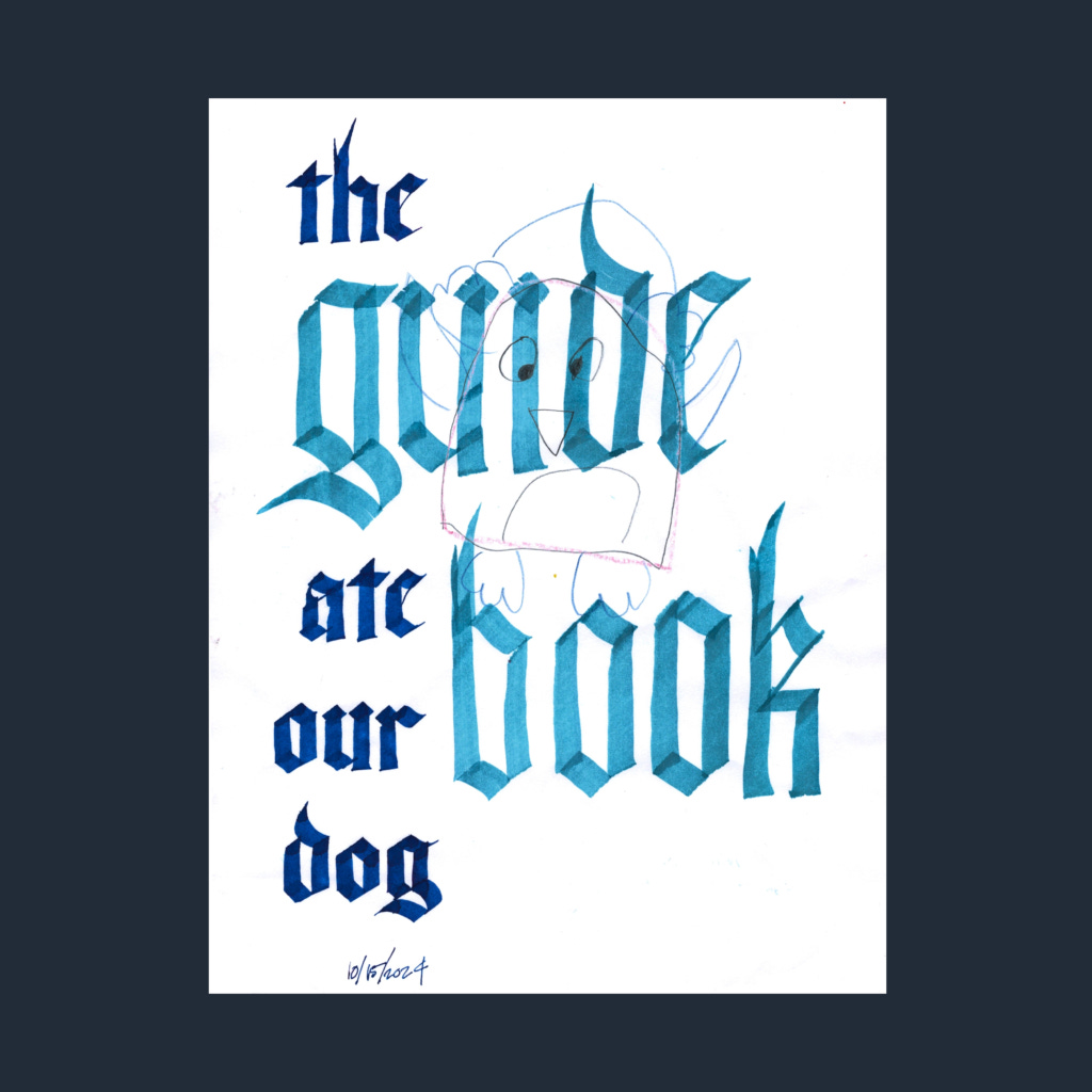
the
guidebook
ate
our
dog
I started with the trope "the dog ate..." but the page hinted at this vastly better poem.
,
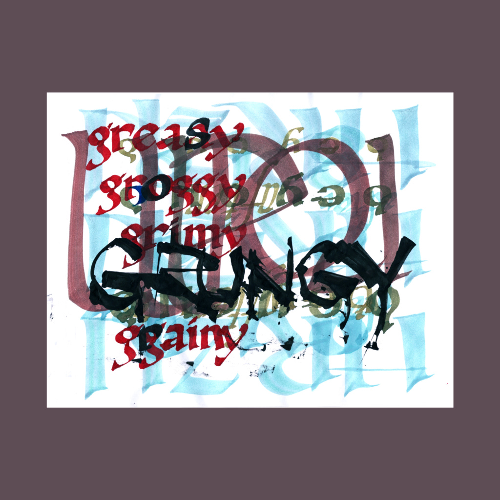
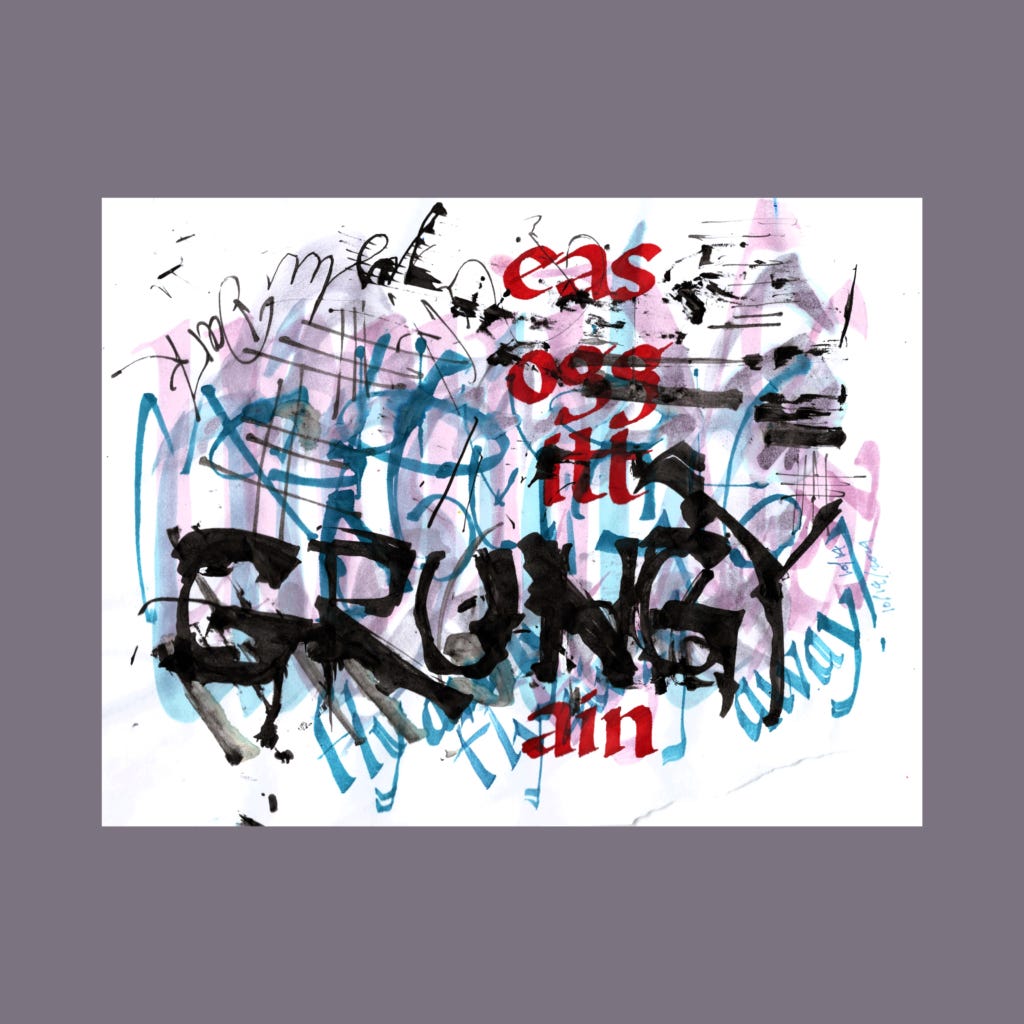
greasy
groggy
gritty
grungy
grainy
I made a couple mistakes on the first version, which was corrected with black ink. While doing that, I realized that the red "gr" and "y" were unnecessary. A fortuitous mistake that led to the second version.
I used a ruling pen for GRUNGY. I've had one for years as part of a compass set, but had no idea what it did. With YouTube and Instagram, I am now cognizant of its capabilities but completely unable to write the lovely flowing script highlighted in those videos. Something to study after Inktober.
,
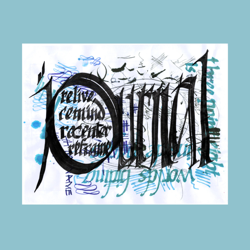
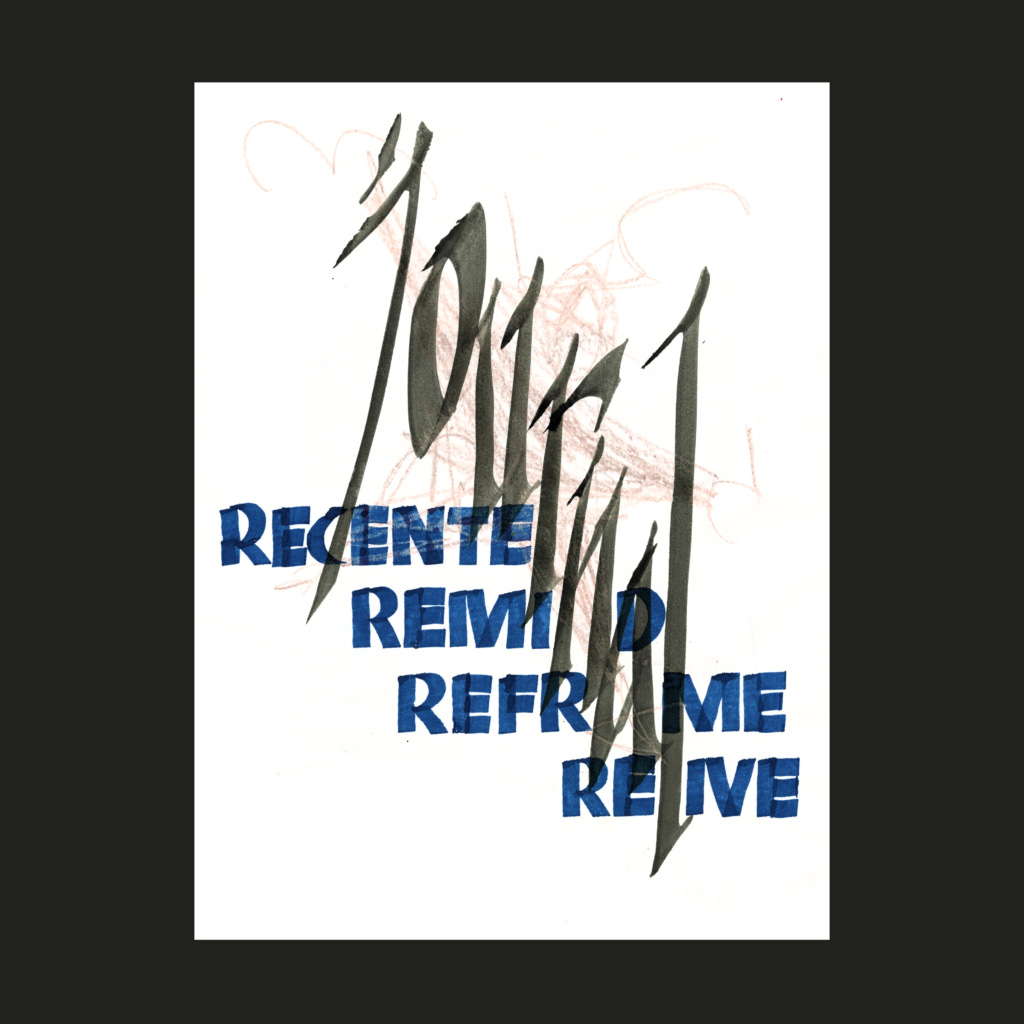
journal
recenter
remind
reframe
relive
Between the two options, I made twenty-two attempts (and more if you include unfinished failures). I'm happy enough with both schemes, though neither one matches what they could have been. It's the Ira Glass notion about the gap between your taste and your skill.
For the vertical "journal" I quickly learned Neuland to contrast against main text. Funny how calligraphy betrays uncertainty and rawness, even in the most blocky forms. (BTW it was wicked tough to avoid spelling errors when writing backwards and skipping a letter in each word).
Both of these final images came from early attempts. Even so, I wouldn't say that those four hours were spent in vain. Sometimes you have to go overboard to realize the limitations of your skill.
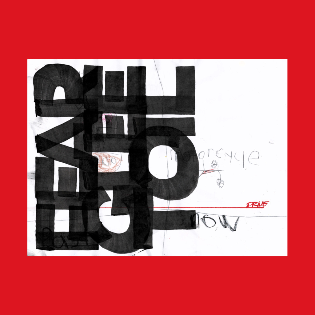
,
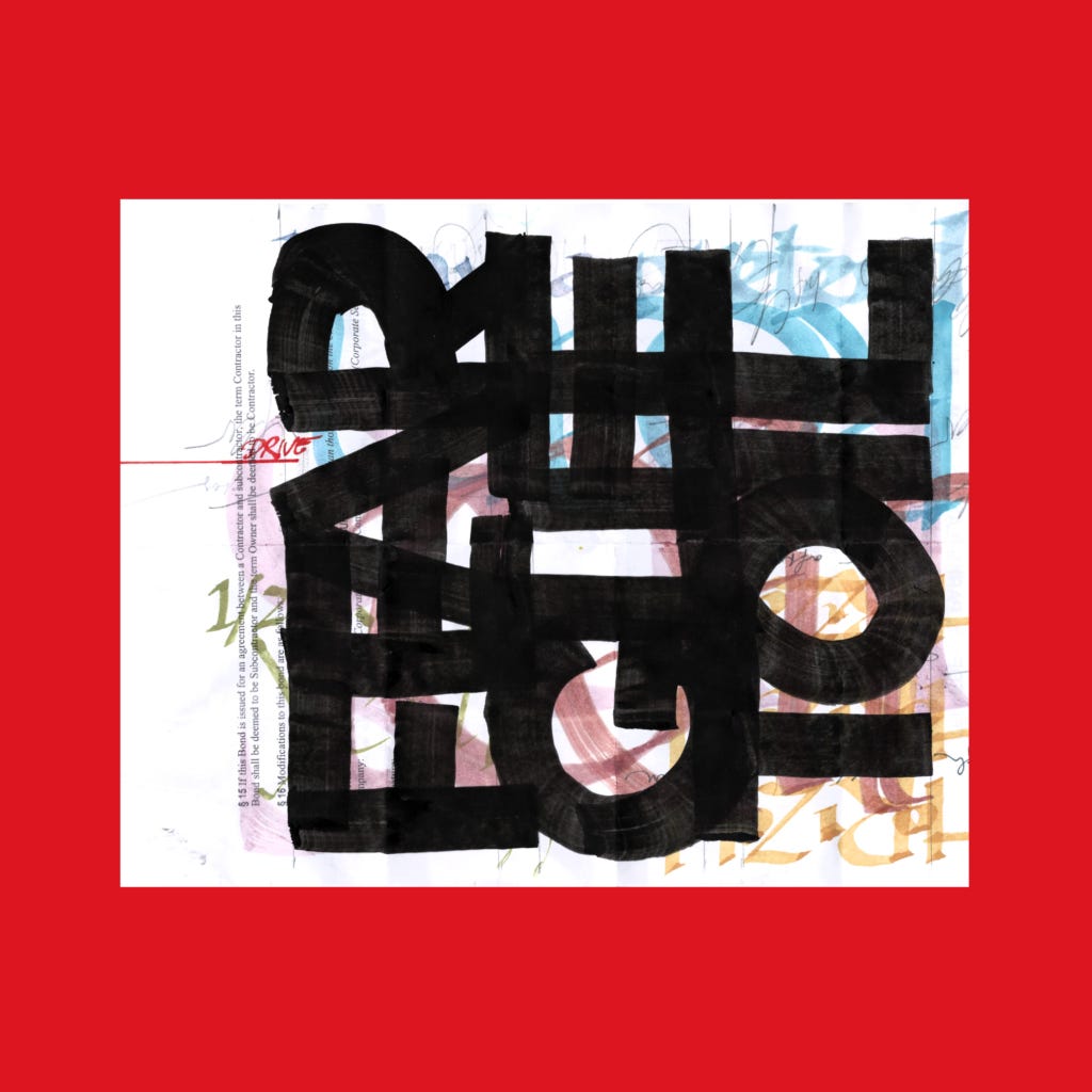
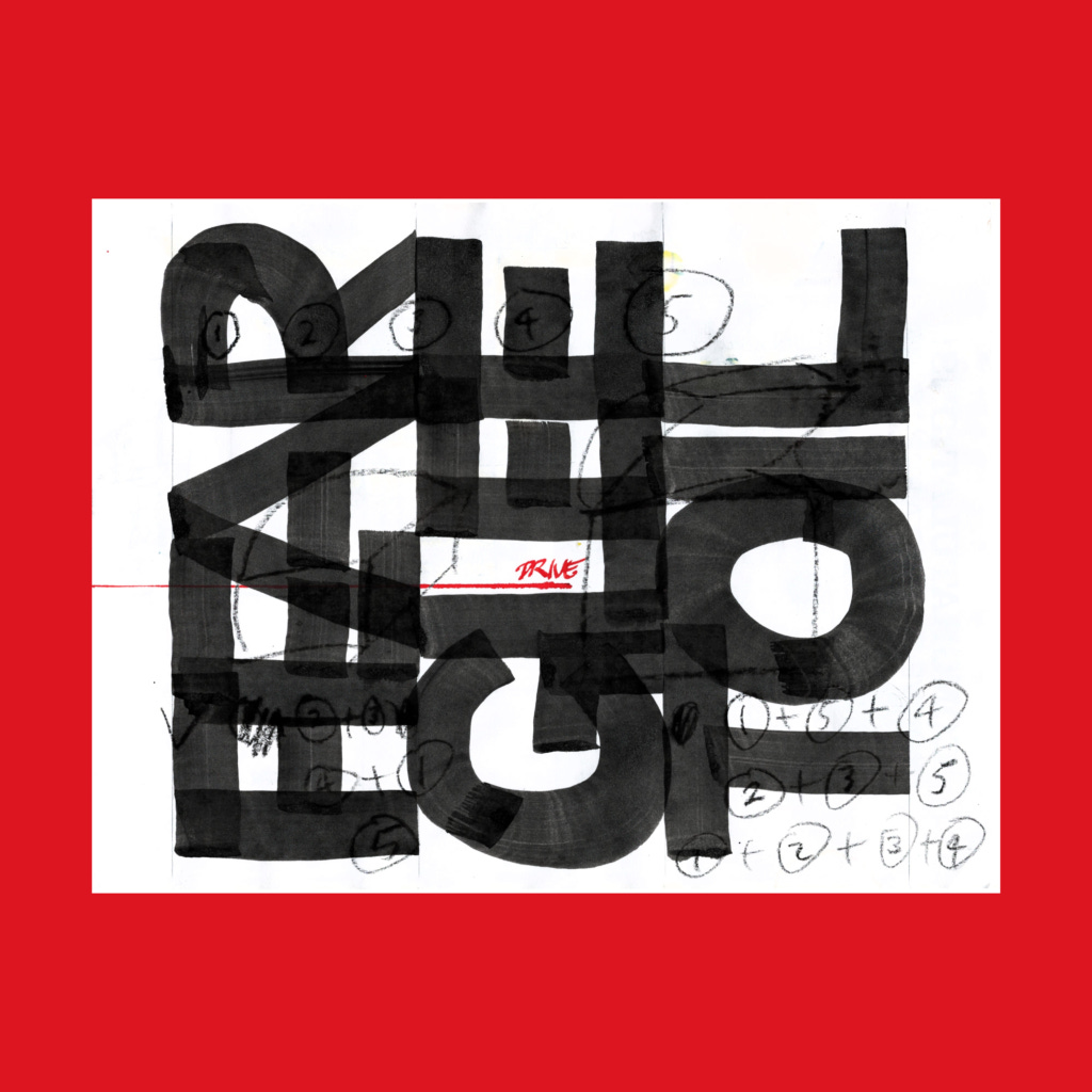
drive
through
fear
glee
toil
These also took a ridiculous number of attempts to get "right". Even then, I had to digitally edit the top version (shifting the page) and bottom version (correcting a mistake on "toil").
It was fun to work in big caps using the 1 inch brush. But always nerve wracking to invest time on a page for a risky blowup on the final last loose word.
"DRIVE" is written with an informal version of my architectural lettering. I would be more tight on drawing sheets, but would use this hand when writing thank you notes after an interview (to remind prospective employers that I was a legit hand draftsman). Beyond that, I also drew guidelines on the sheets, instead of using my printed AutoCAD templates over a lightbox. This exercise was a nice throwback to the old days.
And I finally used the ruling pen as intended—to make thin straight lines!
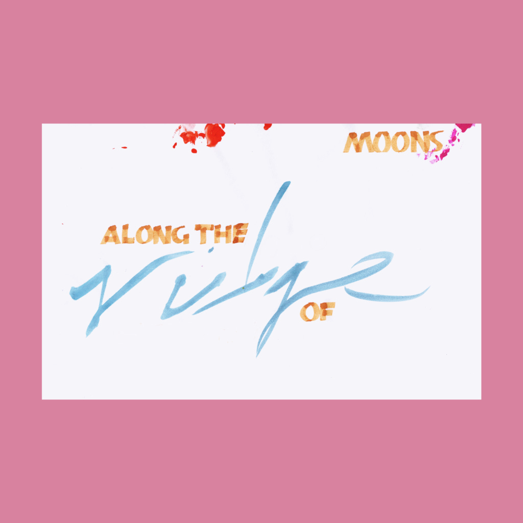
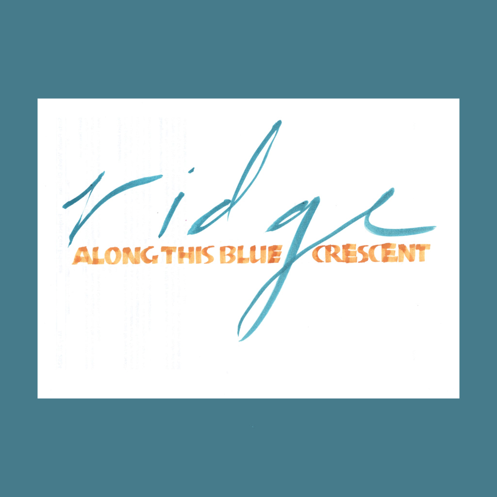
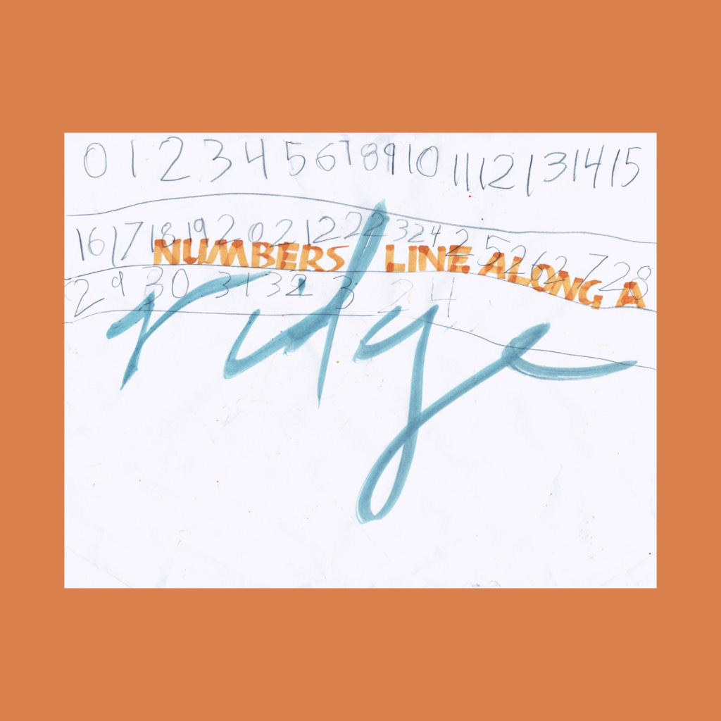
,
along the
ridge
of moons
along this blue ridge crescent
numbers line along a
ridge
This poem was an image first—a flowing script with a counterpoint of small text. I then burnt through sheets of paper trying to write a decent "ridge", eventually settling on a pointed brush. Kill enough trees and you'll eventually stumble into a few decent options.
After that, the 5WP’s were informed by the placement and execution of each "ridge" on the page. There are six other 5WP's that aren't shown, along with twenty+ sheets of now-scrap paper. I wonder how many IG postings by other folks are also from their thirtieth shot. Part of the anxiety of that place must stem from the seductive assumption that everyone else is sharing their single-shot perfection while I clumsily stumble through my endeavor.
,
I don't have many deep thoughts on this week, aside from being tired.
Social media comes with the pressure to constantly to beat your previous best. That dynamic might be beneficial for a month-long push, but it must grind artists down over the long haul, especially with the casino gamification of the algorithm.
I'm not sure how artists can sustain a long term career, then again we've had the starving artist trope in our society long before Zuckerberg and OpenAI ate the internet.
Thoughts and prayers to all the real ones out there.
Cya next week!
,
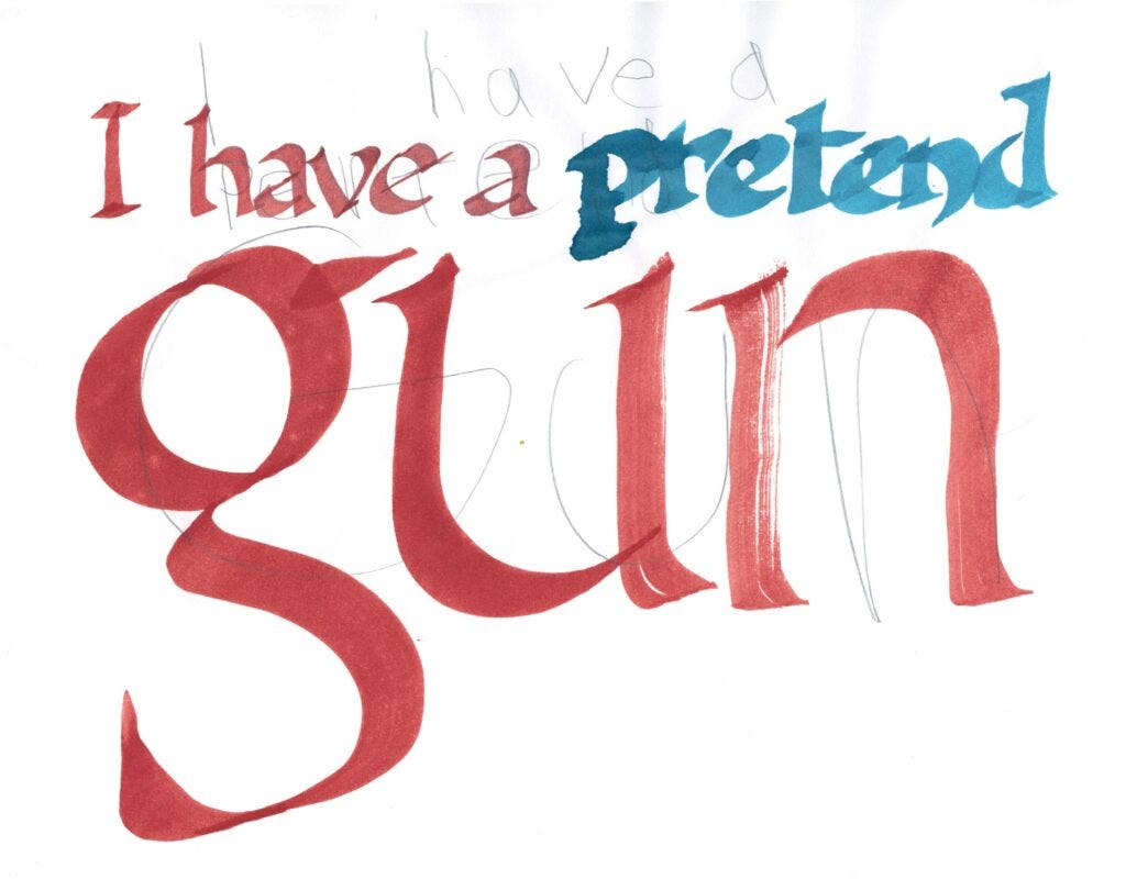
Last weekend, the boy asked me to script this up. We’re no 2nd Amendment family, and we barely watch TV. When I asked him how he came up of the original sentence, he quickly added an adjective.
.


This session was a mind-blower. You're indeed exceeding your previous personal best. The layouts for each piece defied all my expectations of calligraphic art. It's so much more that just writing a sign. And your kids' backgrounds make it all the more intriquing.
So much experimentation going on! I love watching how you're exploring ideas. Loved the ones from 10/15 in particular for some reason—I think it was the compositions you used? They feel balanced but also not too rigid.
Thanks so much for sharing. They always give me a lot to think about in terms of what's possible.